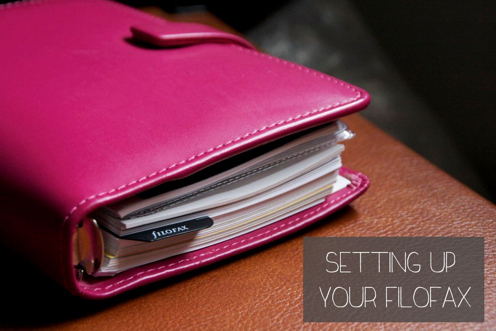
My Filofax is my baby; I’d be a hot mess without it, and my life would be in shambles.
Maybe I exaggerate. Maybe. But my life would definitely be more disorganized!
Everyone seems to have their own way to set up their planner, from what weekly sheets they use to how they keep track of tasks, and rightfully so! I can’t imagine the same set up working universally, since everyone has their own unique schedules, goals, priorities, and ways of keeping organized! I don’t even have my layout figured out yet! The minute I think I do, I find a better way of writing things down or stashing my to-do lists, so my Filofax is in a constant state of colorful flux.
However, here are some general guidelines I follow:
♥ I’m a visual person, so I like to see the whole month laid out ahead of me and keep Filofax’s full monthly calendar pages at the beginning of my planner to do just that. I don’t make detailed plans or to-dos on the monthly pages, but it’s nice to be able to see what’s coming up at a quick glance. This gets used more for planning things in relation to one another, like meetings I have to attend, plans with friends, due dates, etc.
♥ My go to weekly layout is the week on one page, which gives me enough room to write down any appointments and schedule-related things, as well as jot down some memos and lists. This layout also lets me have the whole right-hand side of the page blank for longer notes, crazy to-do lists, and other miscellany.
♥ The one thing I do is color code everything. I’d like to get some nice colored dots to use as a key so I can keep it all straight, but each category has a corresponding color that I use throughout. Blog-related tasks – any posts, ideas, to-dos that are blog or sponsor-related are in orange; school related things, be they class times or things I need to get done, are in dark blue. And personal things like movie dates and “for fun” tasks are in lime green. Associating tasks with colors lets me see what’s on my plate with just a quick glance and visually see how my week is split up.
I’m still looking for the perfect set of pens that writes on washi tape and doesn’t bleed through as much, but these Stabilo 88’s are great for my color coding needs so far!
♥ I like having the blank notes page integrated into my weekly view. As much as I like to keep things cohesive looking, there are some things that I just can’t keep in any particular format and the notes page lets me stick post-its and make little lists and memos as I need them. The actual days of the week I try to keep a clear schedule for, but tasks and things that don’t necessarily have a set day or time to be completed can go over on the notes page and help clear my head.
♥ Don’t forget to pretty it up! It’s much more motivating to use your planner and get those tasks done when your week literally looks fabulous! I’ve got some motivational quotes, pictures, and hockey cards in the front, and purikura and stickers adorning the cover to really make me want to open my planner on a regular basis.
♥ The divided sections in the back are perfect for everything else, like shopping lists, long-term goals, and jotting down blog ideas as they come to me!
Don’t be afraid to change it up! My planner looked wildly different when I was an undergrad taking 5 classes than it does now for student teaching, or even during graduate school for that matter. The templates are there as a guide, but if it’s just not working for you don’t be afraid to change it and make it work!
Some people really go all out as far as personalizing their Filofax goes. I’m guilty of oogling them on Pinterest, but the last time I tried to get adventurous with mine, bad things happened. Sonya, however, inspired me to get crafty and make some pretty dividers, so I’m sensing more bedazzling endeavors to come…
Don’t forget, you can win your very own Filofax as part of my Favorite Things Blogiversary Giveaway!How do you personalize your planner? Any favorite places to stock up on journaling supplies?


Comments are closed.